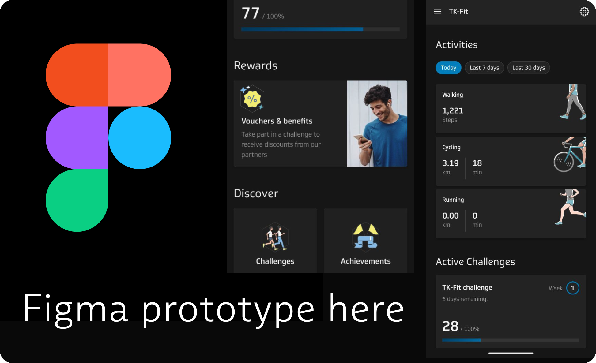
TK Fit case study - improving user engagement with clearer flow for Rewards section
2025 - research, UX, UI, testing
In this case study, I explored the issue of an unclear rewards flow in the TK Fit app (only 20% of users/testers understand how it works) and how it could be redesigned to improve voucher engagement rates and overall feature awareness. By making it clearer when vouchers become available and by explaining how the feature works, the proposed solution (95% feature understanding rate) can help to keep users engaged with the rewards section, give users extra motivation to complete challenges, and make TK’s digital health offering feel even more valuable.
Techniker Krankenkasse (TK) is among the leaders in Germany for delivering a compelling digital experience and a reward system that motivates users to take care of their health. Through TK Fit and its Bonus Program, members are nudged to participate in the activity challenges, doing their annual checkups, cancer screenings etc. TK app (and TK Fit as a part of it) offers clear user experience, but there are a few points where the flow can be improved.


1. The problem hypothesis
Theory: new users do not clearly understand the reward mechanics in TK Fit, leading to low engagement with the rewards section as they might not come back to it. The current rewards interface lacks visual cues that communicate value, progress, and achievement, and the rules for unlocking vouchers (week 3 and week 8 activation conditions) are buried too deep. From a business perspective, this likely results in:
Underutilization of partner vouchers, weakening brand partnership ROI
Missed opportunities to differentiate TK Fit’s value proposition from other health apps
Lower voucher engagement and redemption rates, reducing the perceived added value of TK Fit challenges
If the voucher section feels confusing or underwhelming and doesn’t communicate the rules from the start, users might not go back to it later at all
2. Initial take
Testing the existing flow (I used Maze tool for unmoderated testing and option for users to comment on what was the issue) showed that about 80% of participants didn’t understand the conditions for unlocking the voucher and why they couldn’t collect it now.
My goal was to find weak points and see where the most confusion came from. Heatmap showed that users would try to click the greyed out “collect voucher” button (and nothing happens in this case). And most users followed the Main screen - Rewards path (2), that didn’t show voucher goals.
Some of the things testers questioned:
they look like they’re active, but when I click on one, I still can’t use it
there's no action items or progress bar to track it (the time until voucher unlocks)
it says I need to achieve a voucher goal, but where is this goal? (user coming to voucher page from main page)
Are those all the vouchers? Will I get different ones after week 8? Or do I need to choose my 2nd voucher from the same list?
I see the vouchers, but they don’t explain much, I need to go to the website and read the rules there, it’s confusing
There are 2 parts of the problem with the vouchers: unclear mechanic and vouchers content. I’ll be working with things that UX changes can fix. Solving the offers’ content and value issue would require actual business insights and detail about how TK works with the partners and what’s possible. Like bigger pool of partners, focusing on different target groups and offering different discount types. TK already has more voucher options, than 2-3 years ago, so we assume that this approach is already in progress.
3. What can we do
Make the 3–8 week activation condition obvious on all related screens
Add a tracker/countdown to show progress / might be too much - better start with motivational text that gives some info on progress (Just 1 more week to go etc.)
Add an icon next to rewards on main screen: currently, the entry point is visually dead.
Optional: Change voucher list layout - current flat list has zero perceived journey. Maybe add reward grades: it could boost retention if users get a “win” every other week and get better offers the more they stay active.
But: this proposal needs more actual inside info and data. Needs more frequent content drops and deeper partner inventory. Partnership constraints can be an issue: voucher values and availability may be fixed by contracts, so for now I’ll test the idea and if it’s worth it as a concept at all.
Other gamification elements that TK Fit uses are part of the bigger picture here, for example, badges (achievements). This mechanic has some weak point as well, and in the real scenario, we’d look at all this together, more holistically, depending on time we can afford, recourses and research.
4. First version of proposed flow
Added Rewards Icon to the main screen
Separated vouchers in 2 groups visually: available after week 3 and 8; to test if voucher progression within a challenge can make sense
Added unlocking condition text on the inactive voucher button
5. Testing the new flow and final changes
After testing the first flow version (again used maze as a testing tool) I saw that conditions on unlocking the voucher were still not clear for around 35% of participants. Greyed out button with the condition on it wasn’t obvious enough.
So I introduced a progress bar - now users don’t need to go back to active challenge to check which week they’re on,
added a bright tooltip, explaining the details, if the user would try to click the voucher button,
New flow performed way better: 21 out of 22 testers considered unlocking conditions clear.
Visually separating vouchers into “basic” and “premium” ones didn’t bring much, though. Even if the users registered that visual difference, it didn’t matter to most of them because of the content of the vouchers itself: Some didn’t think the offers were “worth it”, some didn’t find anything in their area of interest. To make visual progression work properly, a deep research into possible partnership deals would be needed, and this would require working together with additional stakeholders like sales, legal and marketing department. So the voucher list stays the same for now.
6. Research and metrics in a real working scenario
1) Research Needed Before Starting. If we were really inside TK, before even touching designs, we’d want data + context from three areas: analytics, partnerships, and user research. Based on the outcome, we’d work not only on UX part, but on content as well.
A. Analytics & Usage Data
Voucher entry point usage - % of users clicking Rewards on main screen vs. from Active Challenge → Voucher Goals
Voucher view-to-redemption numbers (if possible)
-of users who open voucher list
-who click a voucher
-who successfully redeem (partner site/app)Activation timing drop-off
-% reaching week 3, % reaching week 8
-Average time to churn (stop participating in a challenge)Seasonality: are there peaks in redemption during certain months (could affect progression)
B. Business & Partnership Constraints
Voucher inventory: Which partners are locked in, can they provide different offers?
Value perception: Do users see these as “real rewards” or just marketing coupons?
Contractual restrictions: Can we visually highlight partners in a “gamified” way without violating brand guidelines?
Ability to scale: Can we get more partners if we split into more reward tiers (e.g., bi-weekly unlocks)?
C. User Research
Qualitative interviews
-Why do users start a challenge? Is the reward even amongst their points of interest in a challenge?
-How do they perceive the value of the current vouchers?
-Do they understand the week-based unlock mechanic?Usability testing of current flow - give users tasks like “Find out how to get the 50€ voucher” and see where they stumble.
Perceived fairness - do users feel they’re “earning” the voucher, or is it arbitrary?
2) Metrics & Design KPIs for Success
Product Metrics: we’d measure if the redesign actually drives engagement and redemption:
Rewards Entry Rate - % of active users who click Rewards from the main screen now vs before.
Voucher Goal Awareness - % of users who correctly recall unlock conditions (via in-app survey or testing).
Voucher Redemption Rate - # of vouchers redeemed ÷ # of vouchers viewed.
Partner ROI - If trackable, the number of partner purchases or sign-ups coming from TK Fit.
Design KPIs: more qualitative but still measurable:
Clarity Score - Users should rate the reward system as “clear” in post-test surveys.
Perceived Value - “How valuable do you find these rewards?”
Motivation Index - “Does this make you want to complete more weeks in a challenge?”
Navigation Efficiency - Fewer taps/less time to reach voucher conditions from main screen.

Design process is never linear and depends on the product I’m working. But when it comes to working on existing features, it usually comes to this:
This redesigned voucher flow aimed to make reward milestones clearer, more engaging, and better integrated into TK Fit’s existing challenge structure.
Testing the new design in Maze revealed promising results. Initially, 80% of users didn’t understand the rules of the feature, but after 2 iterations, 95% of testers were able to understand how it works.